
8/5/2025 - 7 Minute Read

In the realm of patent prosecution, illustrations are often one of the first touchpoints examiners have with an application. An effective drawing does more than meet USPTO requirements—it anticipates potential objections, supports the claims, and ensures that what’s filed reflects exactly what the applicant intends to protect. At Blueshift Design, I specialize in transforming reference images into formal patent illustrations that align with the nuances of both utility and design applications.
Every drawing project begins with identifying the patent context. While this may seem elementary, it has far-reaching implications for how the illustration is structured and what elements are emphasized. For utility patents, the drawings must support the functional language of the claims—often requiring exploded views, cross-sections, or detailed callouts that clarify relationships between components. By contrast, design patents are about appearance alone. Here, precision in visual presentation—shading, surface texture, and consistent perspective—becomes critical, as the drawings effectively define the scope of protection.
This divergence requires not only a different drawing methodology but a different strategic approach to what’s included, omitted, or shown in broken lines. In both cases, it’s not just about drawing what’s there—it’s about drawing what matters.
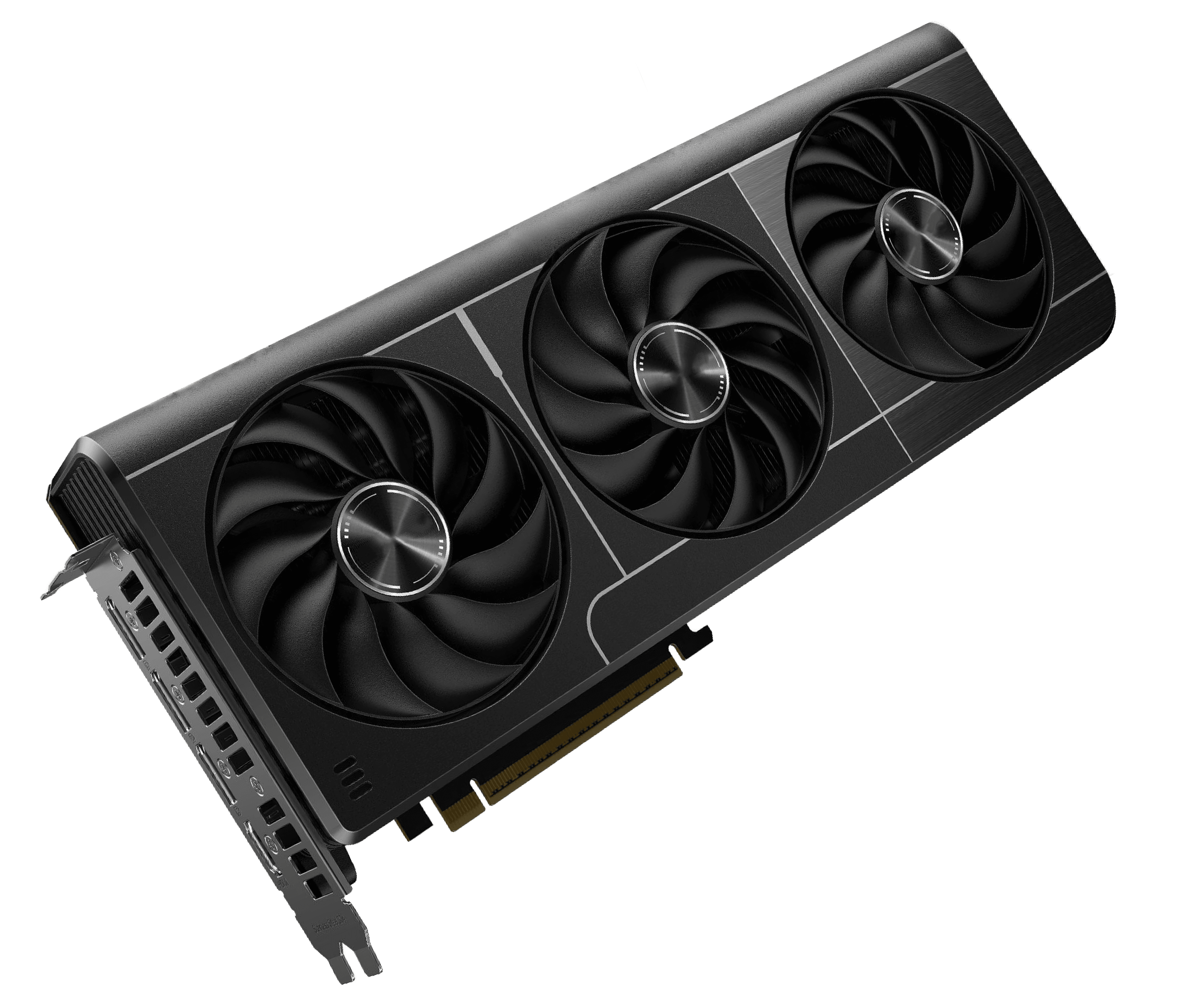
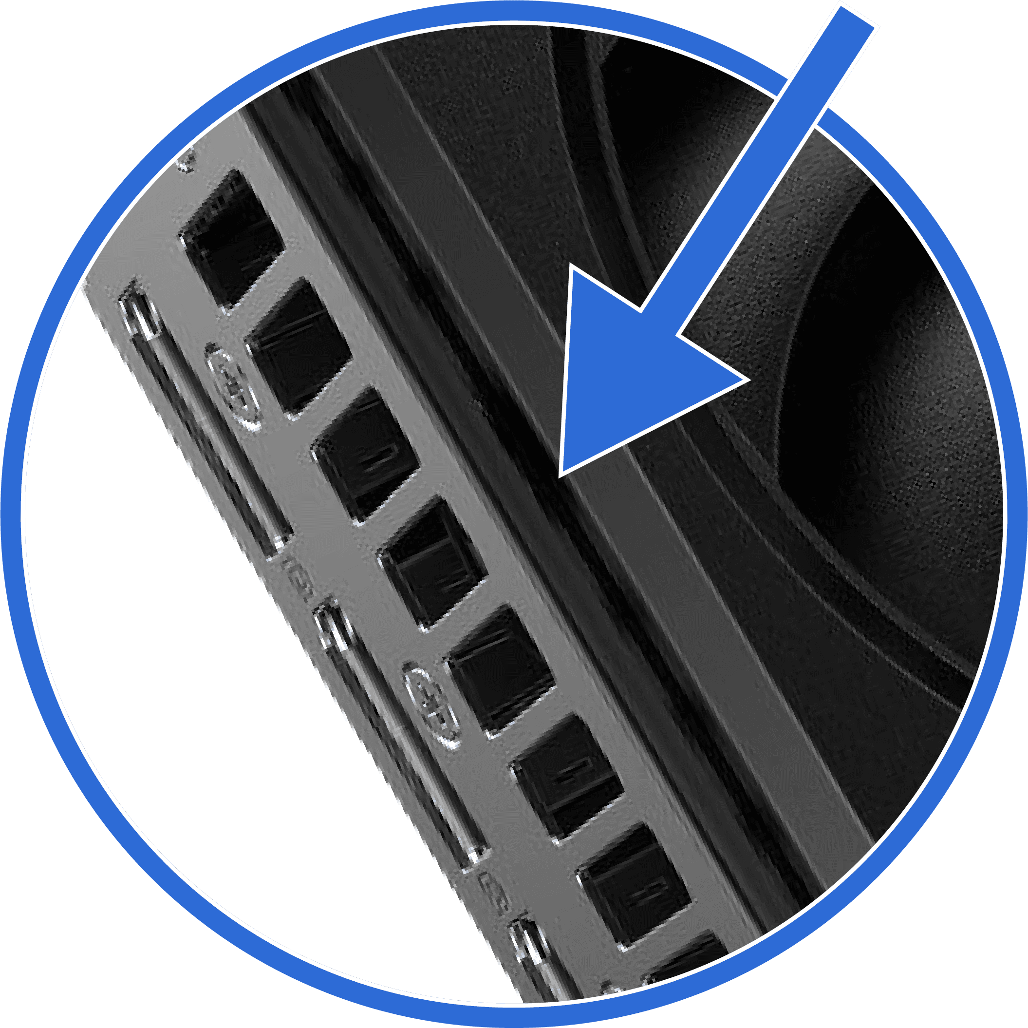
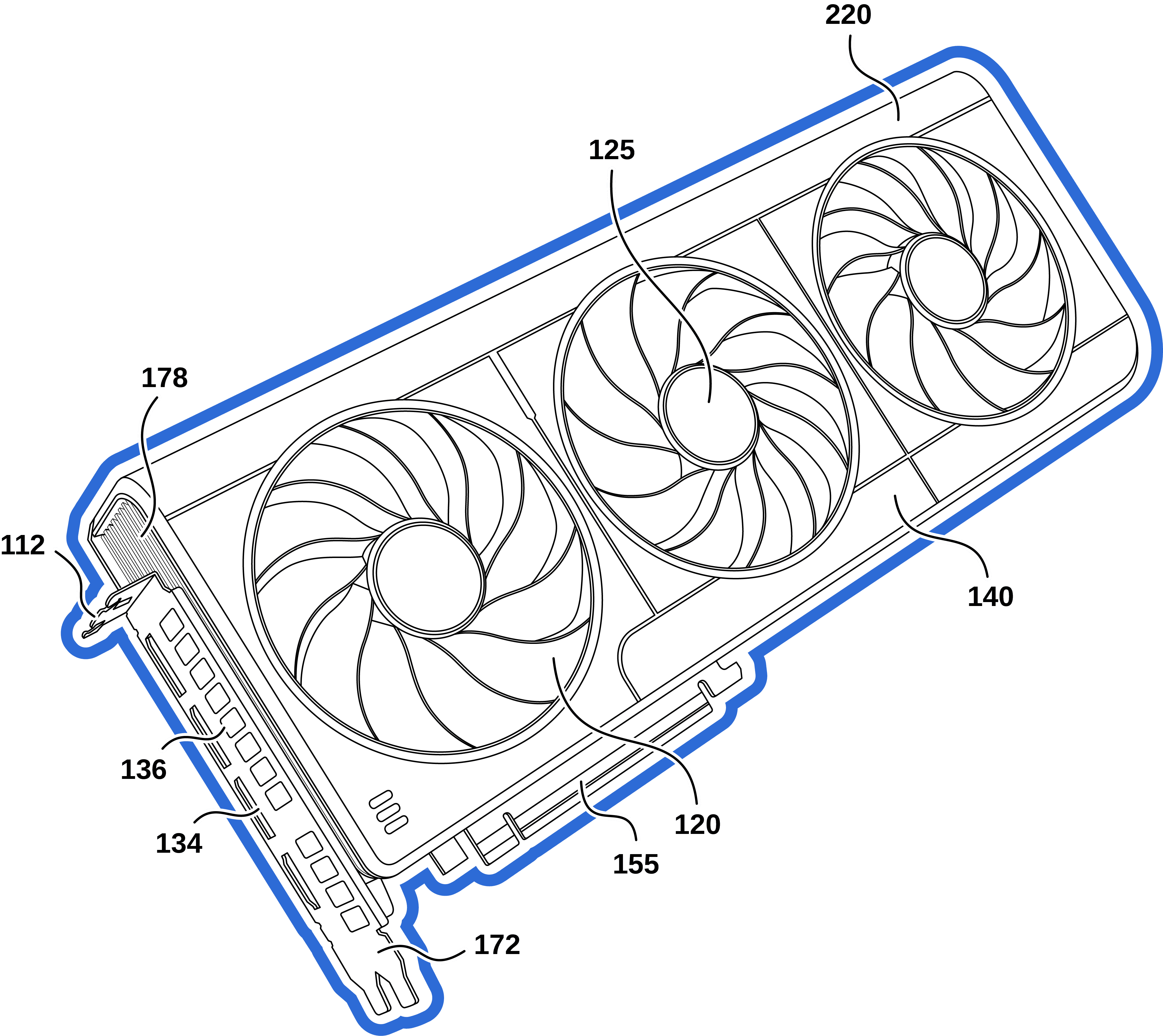
Certain types of hardware raise particularly interesting challenges in this regard. Take, for instance, a case involving a graphics processing unit (GPU). The image provided shows tight, finely detailed ventilation components beneath the cooling fans. This detail isn't visually prominent in the photograph, and it has limited relevance in the context of a utility patent. The structure isn’t essential to the claimed invention, and reproducing such density can invite unnecessary scrutiny during examination. Even in a design application, where visual fidelity is paramount, these kinds of dense interior details often cause more confusion than clarity—especially when their geometry cannot be shown consistently across all required views. In such cases, omission or the use of broken lines becomes not only defensible but advisable.

The same GPU featured a port panel populated with standard USB and HDMI outlets, alongside visible mounting screws. These too are often red herrings. In a utility application, they can be acknowledged through generic callouts or minimal labeling, but rarely warrant detailed rendering unless they play a specific functional role. In a design context, they’re typically disclaimed to avoid dragging common, non-original features into the claim scope. This sort of visual triage—knowing what to de-emphasize and how—is critical to efficient and compliant drafting.
In utility patent drawings, I take a minimalist but strategic approach. I intentionally avoid shading, which the USPTO neither requires nor encourages for utility applications, as it tends to inflate both time and cost without improving the clarity of the disclosure. Every additional line must earn its place by either supporting a claim element or elucidating a mechanical relationship. Including decorative or commercially available elements that don’t advance the understanding of the invention only invites unnecessary complexity.
Clients often provide marketing images or CAD renders with superfluous detail. Part of my job is distilling those down to their essentials—preserving what’s structurally or functionally relevant, and discarding what isn’t. This keeps the drawing package focused, lean, and examiner-friendly, which in turn supports a faster and more cost-effective prosecution process.

Ultimately, a patent drawing should be more than compliant—it should be strategic. Whether supporting a functional narrative in a utility application or locking in the visual footprint of a design, my role is to create illustrations that reflect your legal argument and anticipate procedural friction before it arises. Every line, omission, and perspective is a decision made in service of clarity, cost-efficiency, and prosecution success. At Blueshift Design, I work closely with attorneys to ensure that the patent illustrations submitted not only meet the letter of the law but strengthen the overall application.

