
5 Common Utility Patent Drawing Objections, and How to Avoid Them
5 Common Utility Patent Drawing Objections, and How to Avoid Them
7/22/2025 - 7 Minute Read

When it comes to filing a utility patent, your drawings are more than just visual aids, they’re part of the legal definition of your invention. But many applications get delayed or even rejected because of small, preventable mistakes in the drawing submission.
Here are five of the most common issues I see, along with simple ways to avoid them.
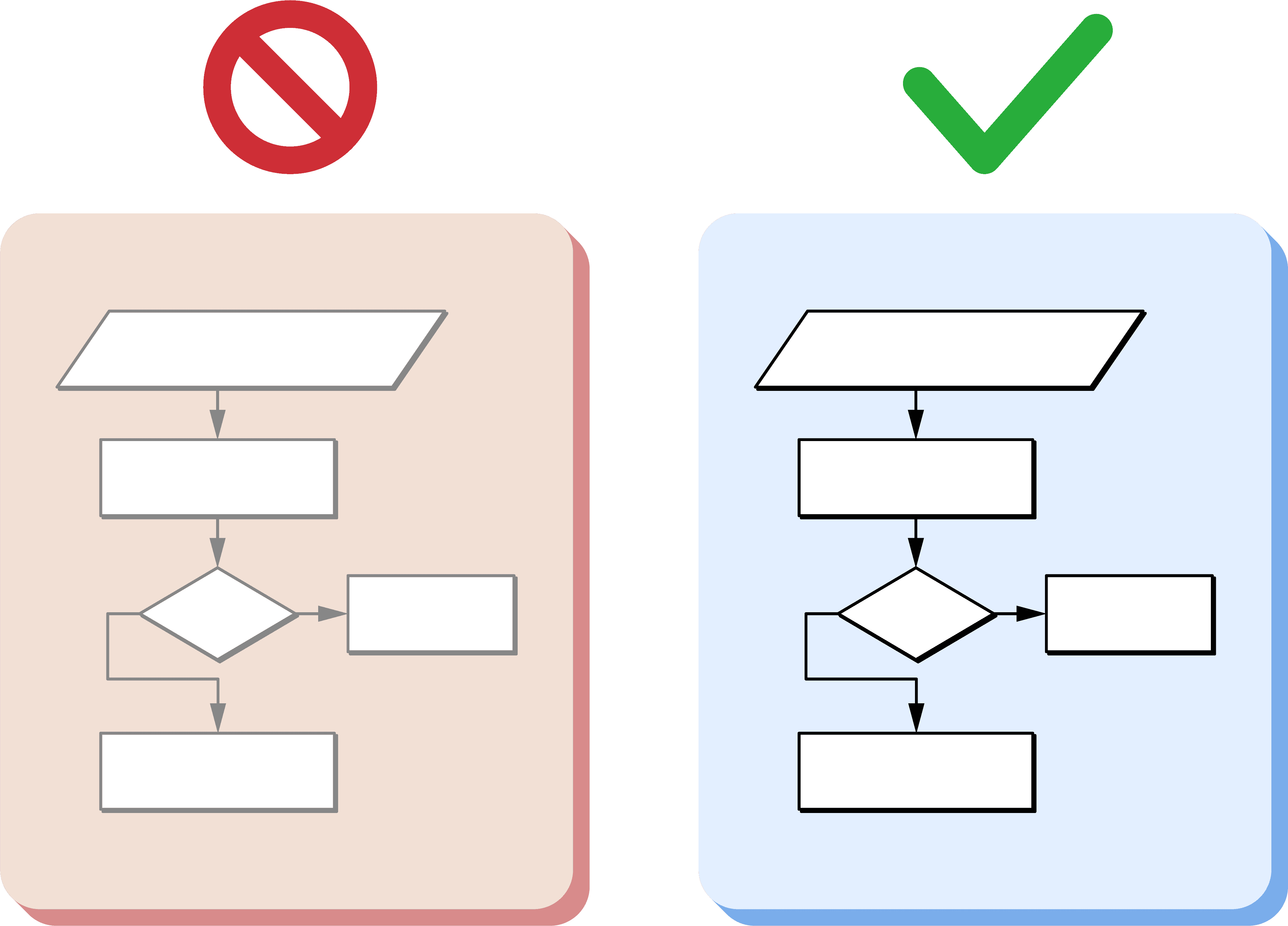
Text That’s Too Small
Text That’s Too Small
The Problem:
Reference numbers or descriptive labels are often added at the last minute, and it’s easy to overlook their size. But if the USPTO reviewer can’t clearly read your reference numerals or text, the drawing may be flagged as non-compliant, even if everything else is accurate.
The Solution:
Make sure all text, including reference numbers, is at least 0.32 cm (1/8 inch) tall. This is the USPTO minimum for legibility in reproduction and printing. Consistent font sizing across all pages also helps maintain clarity.

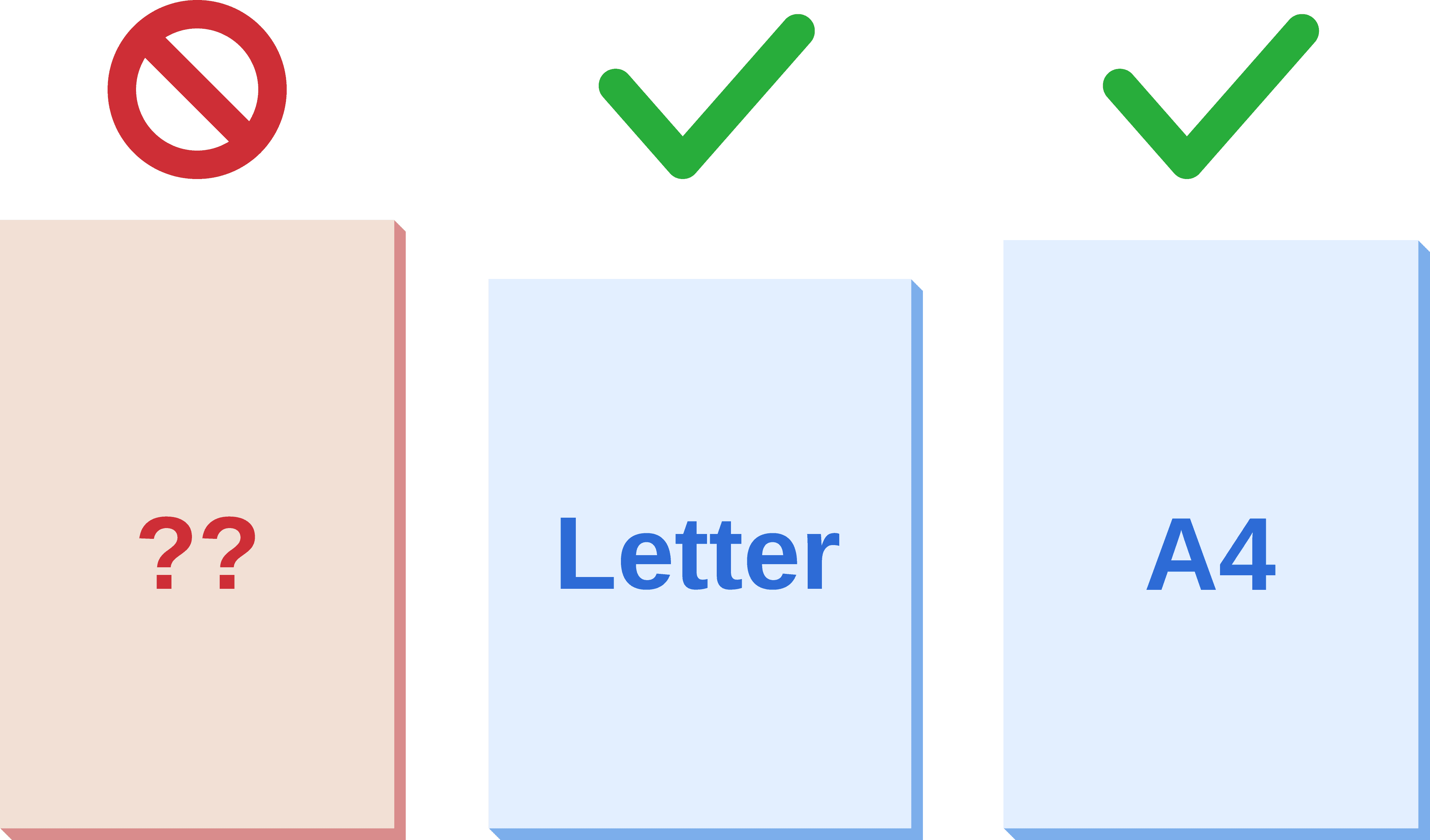
Incorrect Page Size
Incorrect Page Size
The Problem:
Utility drawings must be submitted on standard page sizes, either U.S. Letter or A4. But sometimes templates are slightly off, or drawings are submitted on custom dimensions. Even small deviations can cause delays or outright rejections.
The Solution:
Always make sure drawings are on 8.5" × 11" (U.S. Letter) or A4 (210mm × 297mm) pages. You can double-check your export settings in your PDF.
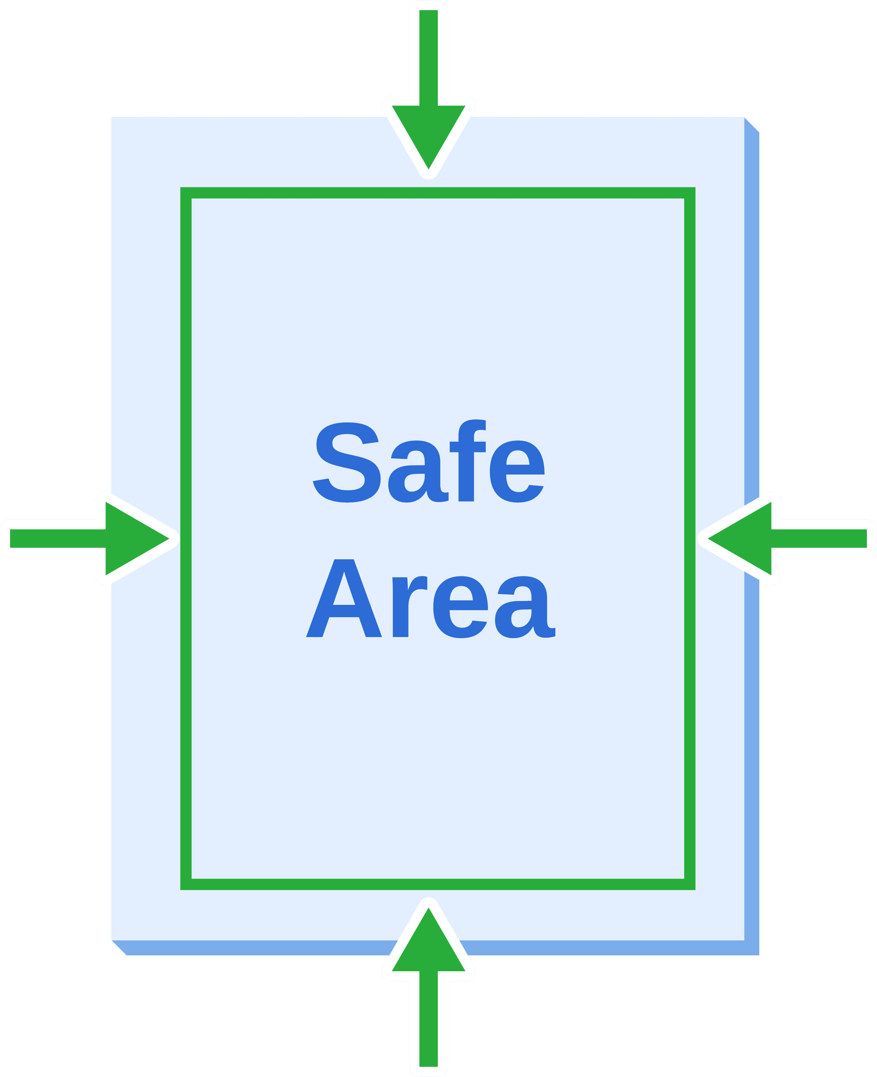
Margins That Don’t Meet Requirements
Margins That Don’t Meet Requirements
The Problem:
Tight margins can prevent drawings from being scanned or printed correctly — especially during processing by the USPTO or if additional labeling is added later. This is a surprisingly common issue that can easily result in a formatting rejection.
The Solution:
Use the required margins for every page:
Top, Bottom and Left: 1 inch (25.4 mm)
Right: 3/4 inch (19.05 mm)
These margins help ensure no part of the drawing or reference numbers are lost during reproduction. Keep all drawing elements and text well within this safe area.
Lines or Images That Are Too Light
Lines or Images That Are Too Light
The Problem:
What looks clear on a backlit screen can turn to mush on paper or in black-and-white scans. Light lines or soft grayscale elements can disappear entirely, especially if line weights are inconsistent or detail is too subtle.
The Solution:
Stick to clean, bold black linework. Avoid using light gray lines or thin strokes. All lines should be uniform and high-contrast, and shaded areas should be represented with approved cross-hatching styles, not gradients or tones. This provides clarity in both digital and print formats and meets USPTO reproduction requirements.
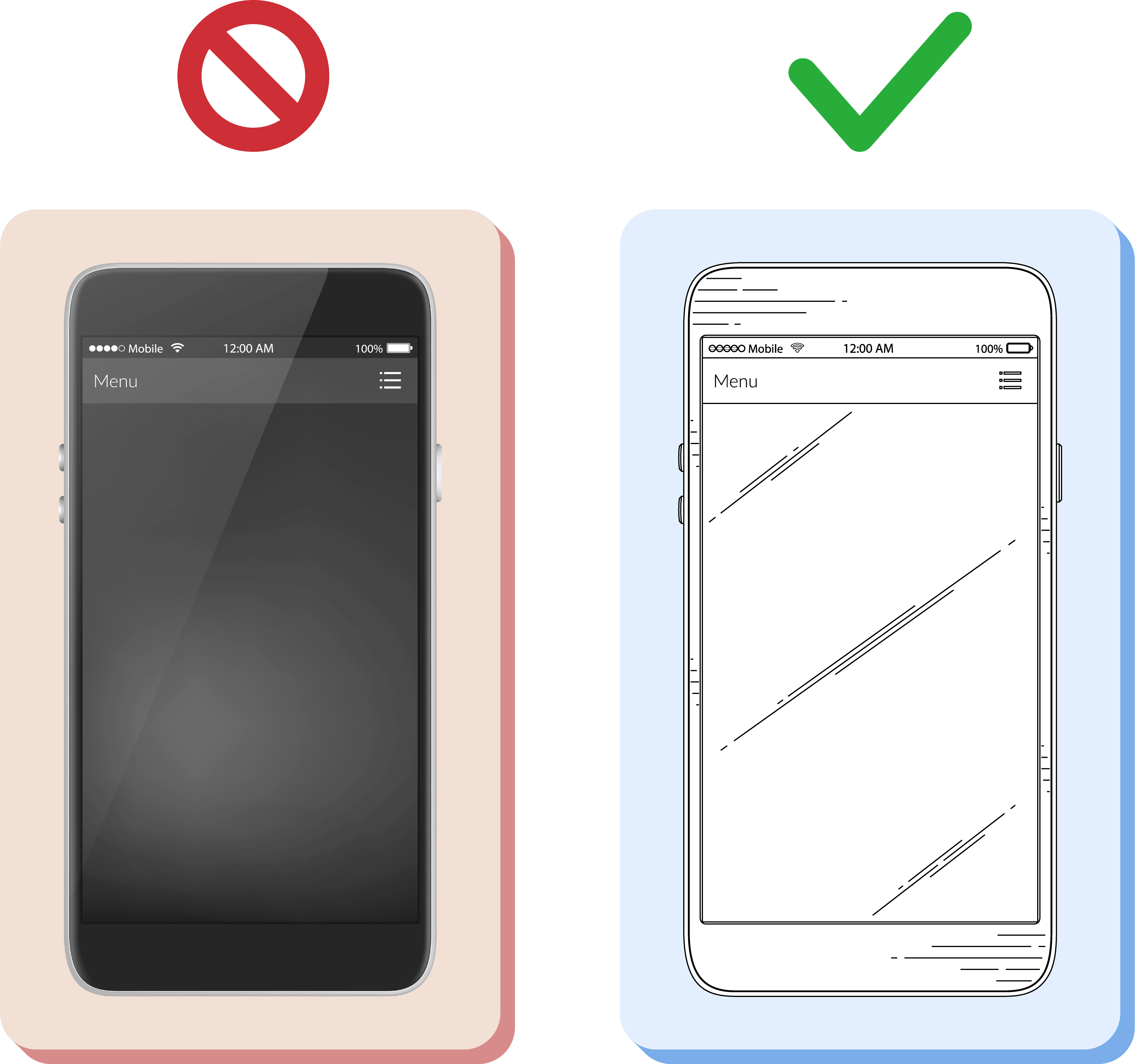
Using Photos Instead of Line Drawings
Using Photos Instead of Line Drawings
The Problem:
Photographs are almost always rejected in utility applications unless there’s truly no other way to depict the invention. Unfortunately, many applicants try to include photos, either due to time constraints or because the design seems too complex for a drawing. This nearly always leads to rework.
The Solution:
Whenever possible, convert photographs into black-and-white line drawings. Even intricate mechanical parts or electronic components can and should be illustrated in this format. In rare cases such as tissue cross-sections or cell cultures, grayscale photos may be used.
Get It Right the First Time
These mistakes are easy to overlook, but they can result in costly office actions, resubmissions, or worse, outright rejections. Attorneys and inventors already have enough to handle without dealing with drawing compliance headaches.
At Blueshift Design, I specialize in producing clear, compliant utility patent drawings that meet USPTO formatting standards from the start. Whether you're filing a single application or managing a portfolio, I help you submit with confidence.
Contact me today and take 30% off your first project!
Your project.
My help.
Blueshift Design
Seamless Communication
Expert Illustration


Email for a Free Estimate
Your project.
My help.
Blueshift Design
Seamless Communication
Expert Illustration
Email for a Free Estimate
Your project.
My help.
Blueshift Design
Seamless Communication
Expert Illustration